5 Design Mistakes That Law Firms Make with Their Websites
- Paul Richardson
- Nov 11, 2020
- 2 min read

Updated: Dec 1, 2022
You have probably visited annoying websites before. Perhaps the website of your children’s school takes forever to load. Maybe your bank’s website has a counterintuitive design once you log in. Then there are those clickbait websites that start glitching as soon as you click on them and make you scroll past lots of irrelevant content before you get to the tiny tidbit of information you came to find (such as the one vegetable that dietitians supposedly caution you never to eat).
In the case of clickbait and other commercial websites, you simply avoid them. Websites that serve a necessary function can get away with being annoying; you have to log into the website of your children’s school to find out their online assignments and any other school-related announcements, no matter how frustrating it is. The bad news is that your law firm’s website may be getting on the nerves of prospective clients who would have hired you if your website were not some aggravating. This means that it is time to redesign your website and hire some legal content writers to create content for it.
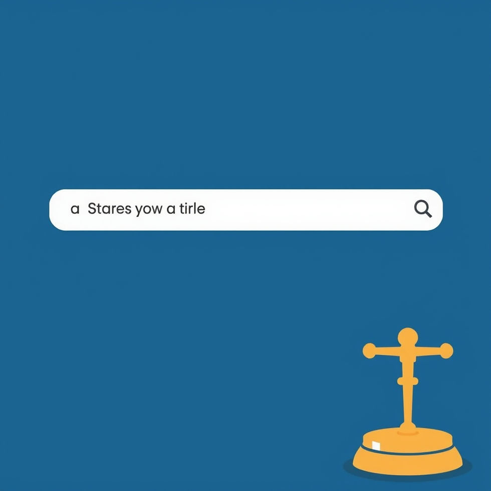
1. The Layout Is Too Busy
A cluttered layout makes it difficult for visitors to find the information they need on your site. Do not try to dump too much information on your home page; it is better for your site to have lots of pages, each with a reasonable amount of content, and make it easy to navigate to those pages. Instead, you should have an elegant menu bar across the top of your site, with user-friendly drop-down menus to take visitors to the content they are seeking. Your contact information should also display prominently on the homepage
2. The Layout Is Too Plain
You don’t want your homepage and content page to be too busy, but they also shouldn’t be too empty. If they have only a few words or do not have images, they will look unfinished, and visitors will take their clicks elsewhere.

3. It Is Difficult to Find the Contact Information
Your contact information should appear at the top and bottom of every page. It should never be more than one click away, so that prospective clients can call or email you the second that the idea occurs to them to do so.
4. The Site Takes Too Long to Load
If your site takes too long to load, visitors will navigate away from it before they find the information they need. Your bounce rate is that percentage of visitors that click away from your site before engaging meaningfully with it; it is the opposite of your conversion rate. Sites that load too slowly drive up your bounce rate.
5. The Text Is Difficult to Read
Text that is difficult or annoying to read also increases your bounce rate. You can’t go wrong with black text on a white background. Text that is too light or too small will alienate all visitors except those with keen eyesight and a high tolerance for frustration.
Don’t Forget to Update the Blog on Your Law Firm’s Website
Even the most elegantly designed websites need regularly updated content. You can count on the legal writers at Law Blog Writers to create interesting, readable content for your site.


Good website design really matters. Visitors leave quickly if pages look outdated or confusing. Clear layout, fast speed, and mobile support help every niche website, including Bhutan teer related platforms, grow better online.
Government of Rajasthan has introduced SSO Login ID, also known as Single Sign on Identity ID for Bhamashah Card, e-Mitra Card, Building Approval and more). A Single ID (SSO Login , to simplify government services for citizens. Under this scheme, residents of Rajasthan are given a single ID for almost all government services. This allows you to use
GRY News is a trusted platform delivering timely updates from politics, business, technology, sports, and global affairs. As a leading International news website, it offers accurate, unbiased, and engaging stories to keep readers informed. GRY News ensures comprehensive coverage, connecting audiences with important events and perspectives shaping the world today.
Wondering How to Get the CapCut Pro Version for Free? CapCut offers users powerful editing tools, premium effects, and advanced features. While Pro unlocks maximum creativity, CapCut makes editing simple and accessible, helping creators design stunning short-form videos that stand out across platforms without limits.
If you are using CapCut Pro cloud space service, this is my app, I recommend that CapCut store your data and content information. Otherwise, it just stores your account and profile information.